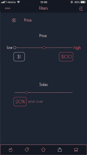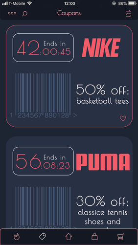
The whole idea of Pursent is to help people find bargains easier, and to be able to maximize rewards systems without hours of web searching and clogging up their emails with bills and spam.
Once you download the app, it walks you through a quick and easy process of making an account, and selecting brands you are interested in. After doing this, the app is able to sign you up for rewards cards and credit cards so that you can get those benefits without having to keep track of bills and other emails.
From there the process is simple, just shop. There are several different tabs which help users to sort out content, and make sure they they are finding the best deals for them without hours of searching.
what is pursent ?
Pursent is a hypothetical app that I designed to streamline online discount shopping. This page will walk you through how I developed the visual identity of the app in a way that aided the apps functionality and purpose. While also prioritizing a clean and vibrant aesthetic.
But first... how does it work?

The whole idea of Pursent is to help people find bargains easier, and to be able to maximize rewards systems without hours of web searching and clogging up their emails with bills and spam.
Once you download the app, it walks you through a quick and easy process of making an account, and selecting brands you are interested in. After doing this, the app is able to sign you up for rewards cards and credit cards so that you can get those benefits without having to keep track of bills and other emails.
From there the process is simple, just shop. There are several different tabs which help users to sort out content, and make sure they they are finding the best deals for them without hours of searching.

One of the first creative decisions I usually make is choosing a color palette. This is because I find that having a color palette really helps define the tone and direction of a project. With this app I had several main considerations in mind.
Firstly, I wanted to use colors that had enough versatility so that I could design both a light and a dark theme for the app, without it being too disruptive. This required that my colors have a large range in value so that the light and dark colors could be switched with the themes.
Secondly, I wanted colors that could grab your attention, but didn't feel too aggressive. This would allow me to use color to add hierarchy to content, without users feeling like they are getting attacked or taken advantage of, which is often a concern in online shopping.
Final Color Palette

While the identity for the app was important, I didn't spend too much time on it since the bulk of the project was in the execution of designing all the screens. Beyond the color palette I wanted the other elements of the identity to work simply together in order to express the application's purpose.
The identity revolved around the percent symbol since this is the universal symbol for discount shoppers. For the name I ended up choosing pursent because it combined the percent symbol, with a purse. Along with this I wanted a geometric sans serif typeface that could work well with the circles and curves of the apps identity
Early on in the process I sketched out a wireframe in order to ensure that I didn't have dead ends in the UI, and that the app flowed well in terms of content. Here's a final screen map that shows how the app navigates different screens and tabs.

Early on I realized that I was going to need an extensive selection of icons in order to maintain visual consistency in the app. Rather than search for online freebies I made a custom icon library so that I could create icons with a consistent weight, curvature, and style to fit into the rest of pursent's visual identity.
One of the important aspects of designing an app that is based around sales is adding sufficient hierarchy. I wanted it to be easy for users to notice the content they are interested in first, allowing them to scroll quickly through other sales when needed. In order to do this I used bright outlines to differentiate followed brands, and blocks of brighter colors to really make favorited items stand out.

While I prefer dark themes in general, I realized that with an app that is focussed on fashion and shopping, dark colors can set an uninviting tone for the interface. Because of this I also set out a consistent color translation between themes so that users could transition between them without any confusion

Screen Library


