What is it?
Malk is a visual identity for a milk shop (or a malk shop) based in Long beach California. Because the LA area is over saturated with coffee shops I wanted to make a brand that would stand out and prove itself as a viable alternative to coffee. When creating the name, I was looking for something sassy and confident. A name that would be clear, but also make potential clients curious.
Malk.
My early logo ideas took three different routes. They were based on cow parts, liquid milk shapes, and the typographic forms of the letters.
After several different tests I decided that I wanted to go with a bold typeface, and then add add a liquid texture that would mimic milk as well as the hide of a cow.
For the type itself I ended up using letterforms I made in Illustrator with a modified A that was set in Gill Sans Ultra Bold. After some experimentation with different ways of creating liquid textures I ended up with the final logo for Malk.

Type drawn with the pen tool
Gill Sans Utra Bold
Final logo, with various layouts

From here, expanding the identity and designing business cards and marketing collateral was pretty straightforward. In my logo experiments I landed on a fun, but punchy color palette that tied the colors of chocolate and strawberry milk together, while also referencing cow's udders and hides. Along with this, I finalized two font choices for the identity. Since the logo didn't have a full typeface to accompany it, I matched it with Shrikhand Regular, and used Gill Sans MT Light for larger bodies of text.


Business card drafts
The business cards took surprisingly long for me to nail down, I made over thirty drafts before I created a layout I was satisfied with.
I decided that it was best to keep the content and logo straightforward in order to give enough information, but not get too complicated.
The business card needed to look clean and reflect the identity, but it doesn't have to sell the brand. That's what marketing collateral is for.

Final business card
For marketing I designed a folding brochure that advertised Malk and included the company's backstory. By designing within eight different 5x5 inch squares I was able to have the front and back cover work together, then have the initial opening function separately from the interior spread. Hopefully the diagram in the lower left gives you a better idea of how the physical brochure folding works.
Marketing Collateral


Left Inside
Back Cover
Right Inside
Front Cover
Inside Spread
Loose Middle Page
Along with the promotional material I created a menu. While primarily meant for use as physical prints, the design could also be adapted for a horizontal layout as a menu board in store.
Back

Front

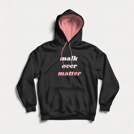
The very final step was creating merchandise and mocking up different designs


